Creating Gradient Borders with CSS
Products have seen a resurgence of gradients in the past year or so. I too wanted to cash in on the PowerPoint circa 2003 aesthetic and as such I took to work on finding how I could add some gradients to the button outlines on my blog. Unfortunately I really struggled to find any decent guides on the matter, but after a little bit of digging and understanding the solution was fairly straightforward. Recently I've been trying to write shorter blog posts more often about little things I've learned, so I thought I'd share that with you folks today!
So from my research, the canonical way to do gradient borders in modern browsers appears to be as such:
.someButton {
  border-image: linear-gradient(to left, #743ad5 0%, #d53a9d 100%);
  border-image-slice: 1;
  border-width: 2px;
}
This is the gradient I am currently using for the navigation buttons on the left. Here border-image allows a developer to pass in a image URL or a gradient (perhaps unintuitively). You can find it's full details on MDN here. In our case we are interested in a gradient so we can use linear-gradient or alternatively a radial-gradient if you're looking for that sort of effect. You can use a direction argument to specify a given direction for the gradient, for example in our case above to left or bottom right might be another example.
A nice little website for generating gradients is https://www.css-gradient.com/, where you can play around with different properties to get your desired result. A note however, you shouldn't need a prefix any more for gradients so you can ignore that!
border-image-slice is the second CSS property we need to fill to get this working. As I was, you might be asking what on earth does this do? If you're anything like me, it can be quite hard to wrap your head around. As an exact definition: "The border-image-slice CSS property divides the image specified by border-image-source in nine regions: the four corners, the four edges and the middle" (MDN). The property has less meaning in the gradient context as it specifies offsets for the image in question to position it for the border in question. border-image-slice can take up to four sets of arguments, each with different behaviours depending on the number of arguments provided. The arguments here can either be a percentage or a number, with the default value for the property being 100%. For our use case, we will be providing it a value of 1. If you want to get a clearer picture, consider seeing the docs for the property.
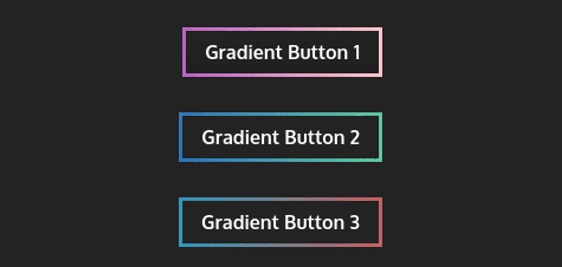
Finally, good old border-width will provide a given width for our border in question. You can adjust it as you see fit to get the desired effect. Here's some little gradient buttons I made for inspiration!
.buttonOne {
  border-image: linear-gradient(to right, #b861c6 0%, #ffc7c7 100%);
  border-image-slice: 1;
  border-width: 3px;
}

.buttonTwo {
  border-image: linear-gradient(to left, #61c69d 0%, #2d72bc 100%);
  border-image-slice: 1;
  border-width: 3px;
}

.buttonTwo {
  border-image: linear-gradient(to left, #2e98bc 0%, #c66262 100%);
  border-image-slice: 1;
  border-width: 3px;
}
Which after applying the class to your button in question would look a little something like this in your browser:
Hopefully that's been a fairly painless guide to generating your own gradient borders in CSS. Have fun!
Published