Effective Cartograms
Earlier today I tweeted something that I had been contemplating for a little while about cartograms. For those of you unfamiliar, a cartogram is a type of map that uses a attribute (population, income etc) of a geographic feature to influence it's area in some capacity. The cartogram that is most familar to most people is the 'continuous irregular cartogram', which can be seen as figure C in this image:
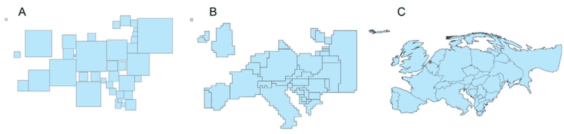
A and B are square cartogram and a continuous regular cartogram respectively. Cartograms have a long history spanning back as far as 1973, and there are over 25 noted algorithms for producing them. In addition there are many different types and variations. Today they are often popular in (but not limited to) academic journals, media companies and interest websites.
What are the potential pitfalls of cartograms? #
I knew that the tweet might be mildly controversial in the mapping/data visualsiation community but I was interested to see others opinions on the matter:
Potentially unpopular opinion: Cartograms are generally not a good way to visualise geographic data
— James Milner (@JamesLMilner) February 15, 2017
Although in hindsight I wish I had worded it slightly differently, my underlying premise remains the same upon writing this post. My reasoning is as follows:
- Cartograms explicitly distort the shape of a geographic area.
- In many cases distortions away from the socially normalised Mercator are so extreme it makes it difficult for the viewer to interpret which geographic region is which.
- There is no obvious way of determining what the attribute scale is, as such there can be no legend to aid the viewer.
- As such it is very difficult to determine middle values. Implicitly it is the geographic region that is least distorted, which may be hard to perceive for the user.
The primary reason for using a map to visualise geographic data is to convey meaning to its viewer, to tell a story about what the underlying geographic trends are. If the user can't decipher what geographic regions they are actually seeing the medium begins to undermine itself. Cartograms make the interpreter have to constantly compare the distorted image they are seeing to their perceived mental image of what that area should look like. Let me give an example from one the top results on Google Images:

As you can see the world is highly distorted on top of the distortion provided by the Mercator projection. In some ways the map fulfills it's purpose. We can see the US has low distortion, Australia is relatively large. However, we can't determine what that hectares value is for any nation. It becomes a lot harder to determine anything of substance about the location or value of low ranking countries other than 'It must be very low and it's somewhere in this array of squashed lines'. Through the critical lens, it is a logical conclusion that cartograms primary purpose is to leave the user with an abstract idea of the relative values of some factor between geographic regions.
At a higher level, legibility and simplicity are two of the Ordnance Survey's key cartographic design principles, both of which I would contend extreme cartograms tend not to conform too. Indeed, my main reasoning for seeing cartograms as unfavourable is not that I think that they are inherently bad, but rather there are more suitable ways to represent said data. I would put forward that a simple choropleth map would often be more suitable than most cartogram representations.
How can cartograms be used effectively? #
Having explored why cartograms can be easily misapplied, there are some potential ways that we can make cartograms more effective for users. My goal for this post was to find some constructive ways to help make better cartograms. The main starting point is to consider why we do geographic representations. Sometimes it is very easy to fall into the pitfall of assuming a key factor is 'does this look cool?', but arguably we do not often ask 'does this help users understand the point we're trying to make?'. To put it plainly, simple and clear tends to beat cool and technical in most use cases.
The use case for cartograms is often to explore relative values of some data set. We forfeit geographic fidelity for (arguably) a more interesting visualisation. So, if we are to utilize this method, how can we use them effectively? Here are some ideas around that:
- Consider, does the data suit a cartogram? Highly skewed or anomalous data may not work exceptionally well in conjunction with a cartogram.
- Avoiding algorithms that produce extreme results that may remove any meaningful geographic shape from the visualisation will make the map more readable and digestible.
- Not mixing the method with other methods like choropleths (i.e. using colours to visualise another variable) can improve readability.
- Would it work well as an animation? An animation from a normal map to a cartogram might help the user deduce which region is which. This reduces the mental mapping of undistorted regions to the cartogram.
- Using labels might be another way to help the user determine what each distorted shape represents, preventing them having to mental gymnastics to figure it out. This may be difficult if distortions are extreme.
- Would the cartogram work well if it was interactive? This would allow users to interogate data using mouse/touch, revealing values and region names.
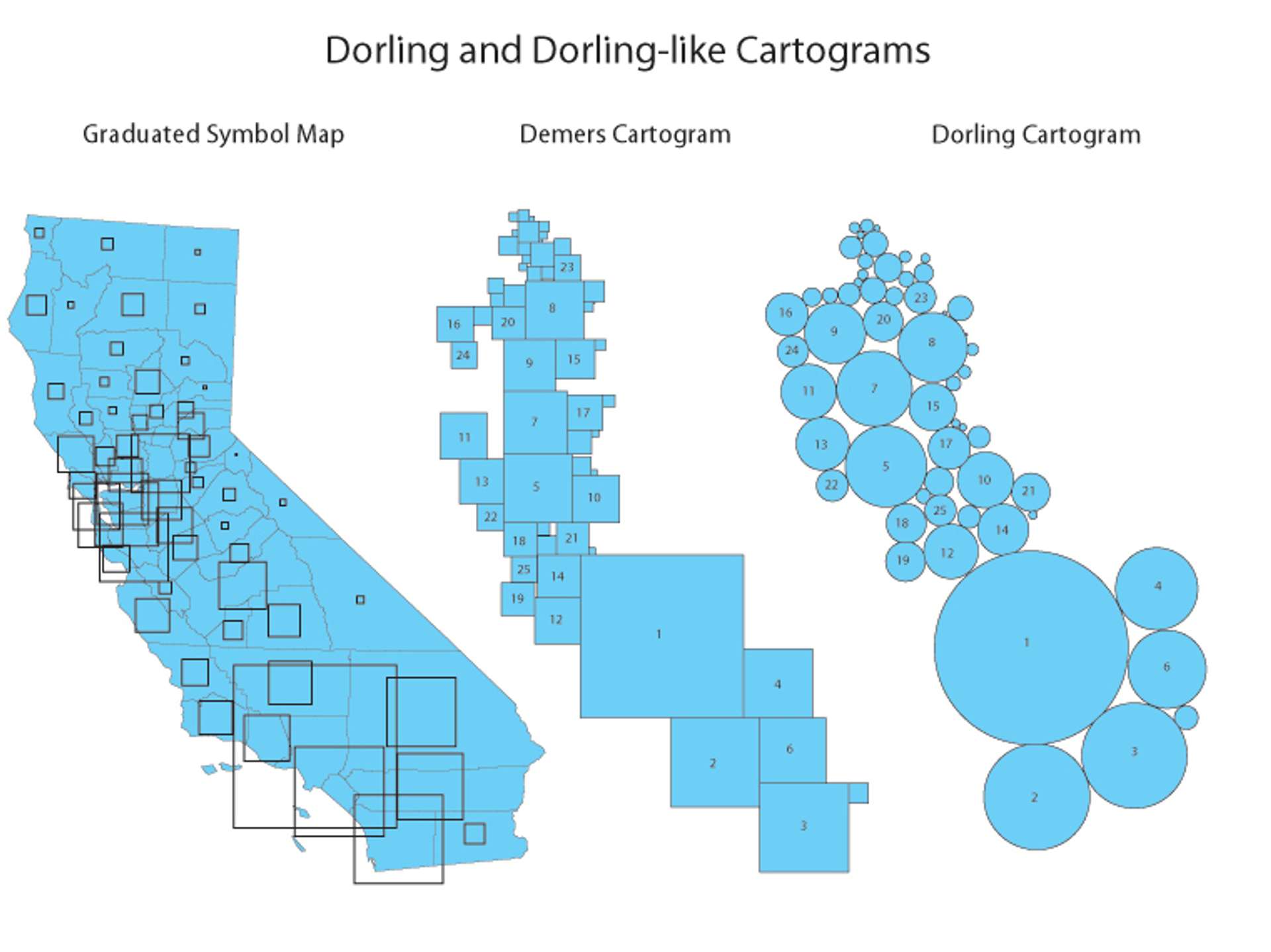
- Another point is considering using Dorling cartograms, these use uniform shapes to represent regions. These might provide a more palatable user friendly visualisation. These visualisation may bring there own host of problems however.
Feedback & Credits #
Do you have an alternative opinion? Something to add? Feel free to comment here or reach out to me on Twitter!
Credits
- Diagram 1 & 3: UCSB, 2002
- Diagram 2: Paul and Hennig, 2016
Published