Dense Spatial Data and User Experience
Across many disciplines we are increasingly seeing the inflation in size of datasets. From megabytes to gigabytes and beyond, with certainly no exception in the geospatial industry. This is in turn posing an ongoing challenges for geospatial developers, web mappers, cartographers and various other spatial data wrangling professionals.
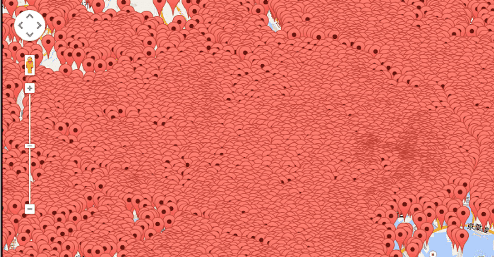
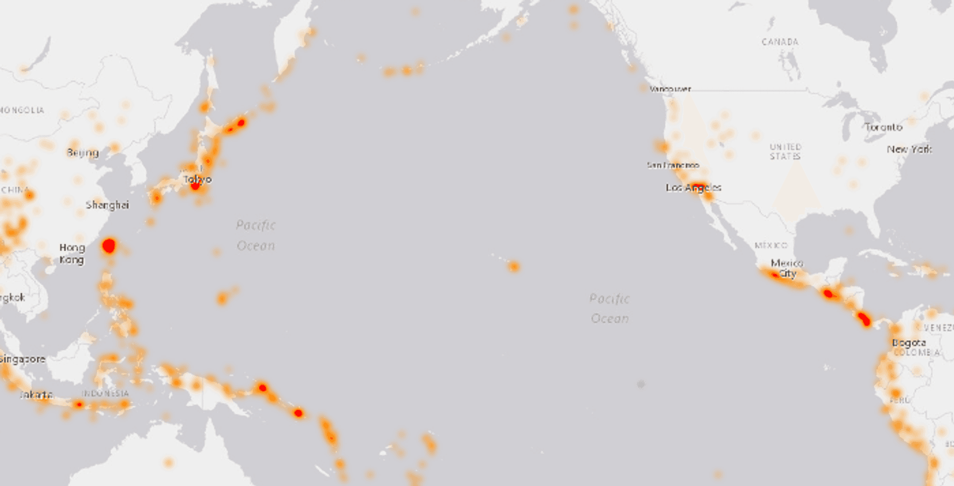
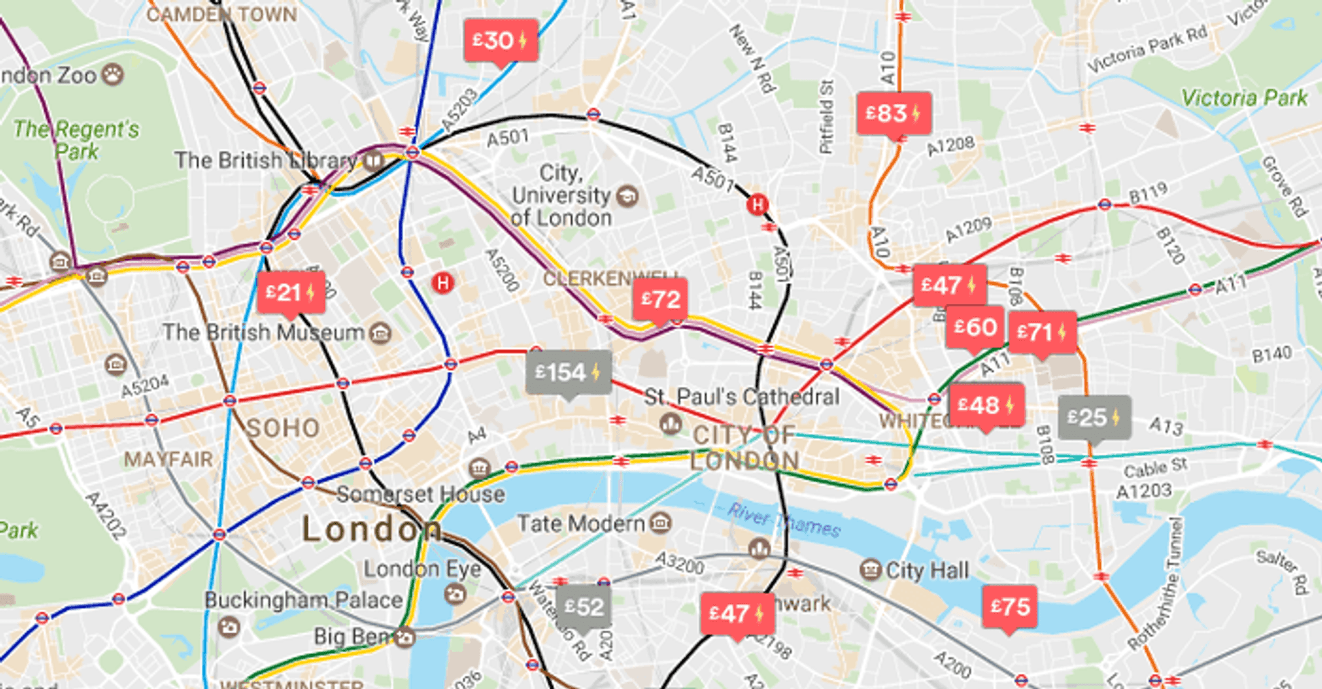
As with web pages, increased density of data on our focus point (our map) can subsequently lead to a poor user experience. Visual clutter and poor cartography detracts from the ability to extract meaning, and also makes exploring data more difficult. As a hyperbolic example see the following image:
This has been a problem that I have faced multiple times at my work helping startups at the Geovation Hub, alongside my own personal projects. As such I thought I would share my thoughts on the subject. The main purpose of this article is to visit a selection of ways to help tackle the problem of visualising dense datasets alongside improving usability of maps along the way.
Disclaimers: The article focuses predominantly on point data from a web mapping perspective; I make no claims at being an expert cartographer!. The Carto team wrote a great blog post covering a fair percentage of the approaches previously, so kudos for that! Lastly this list is not exhaustive and I make no claim any of these methods are particularly novel. With all that out the way, let's take a look!
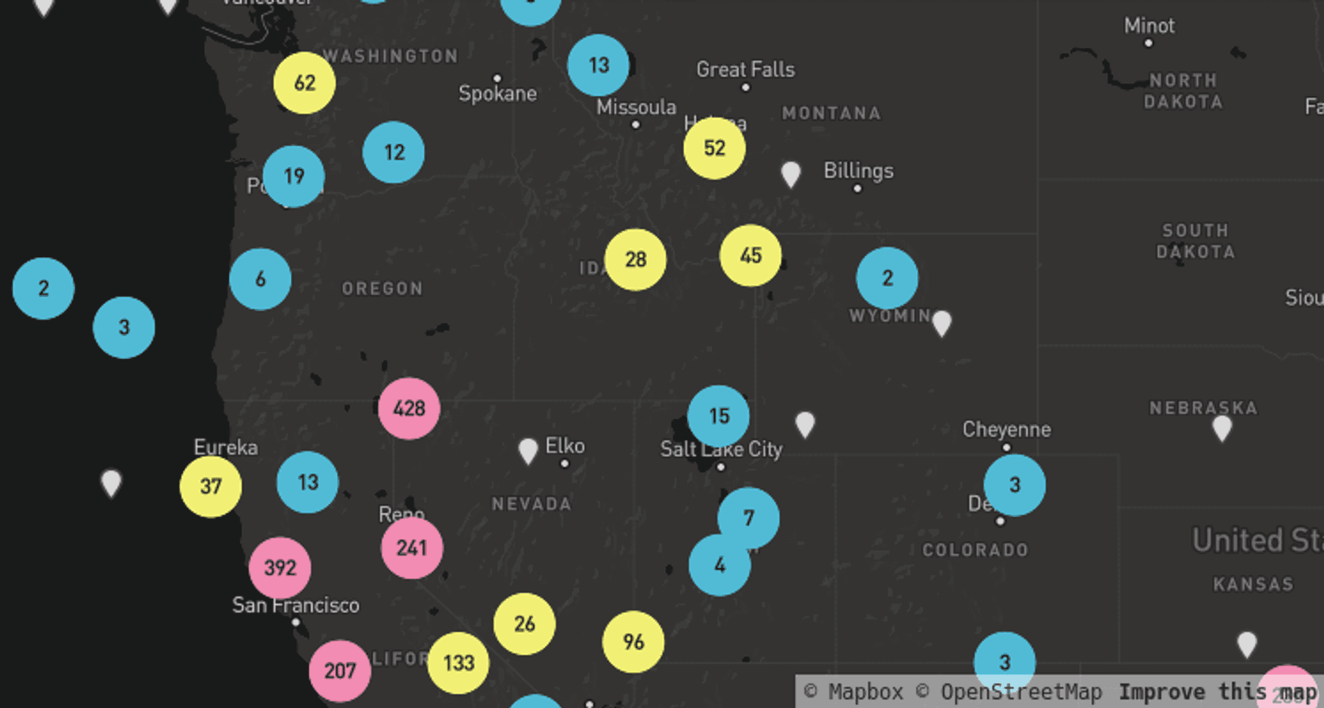
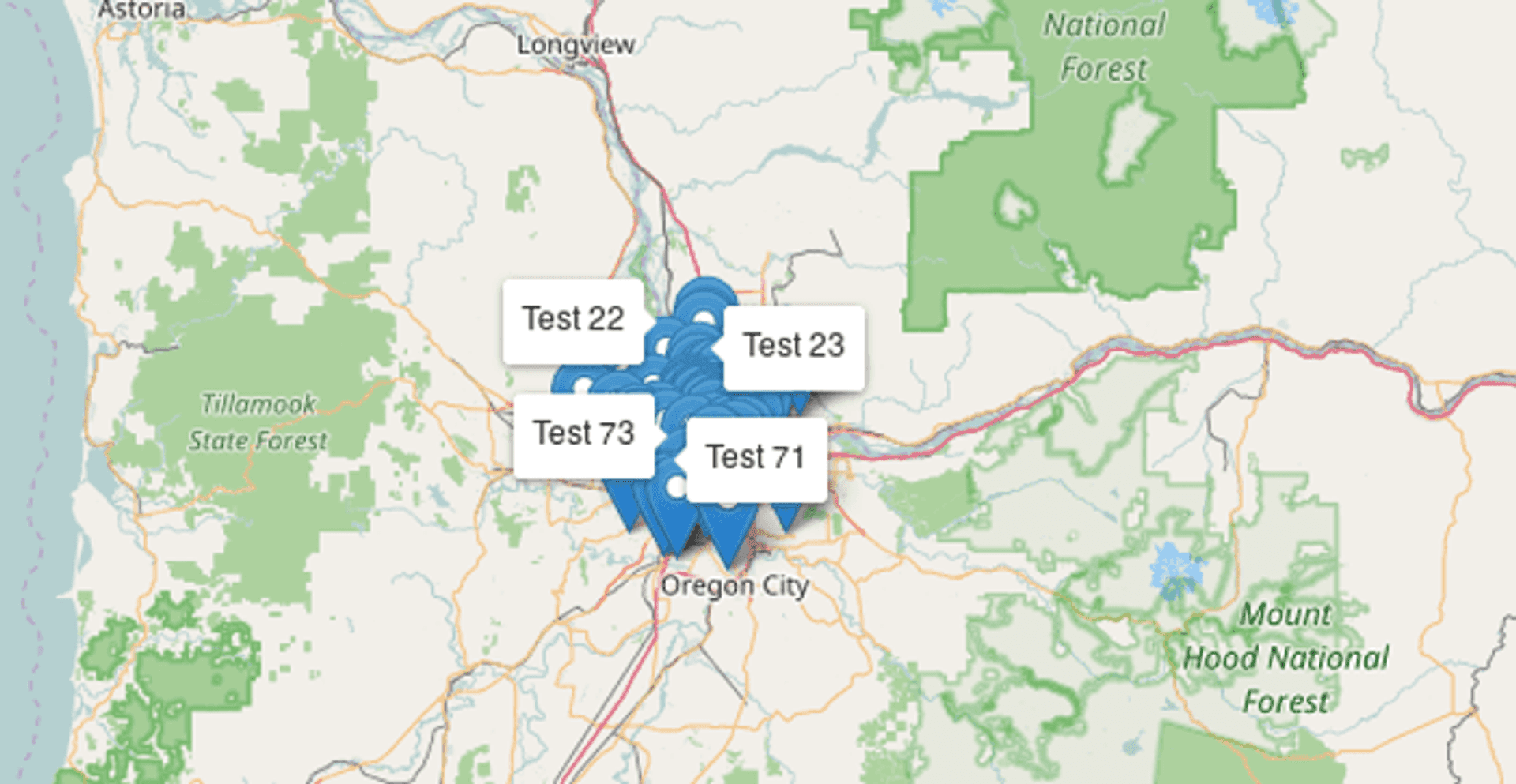
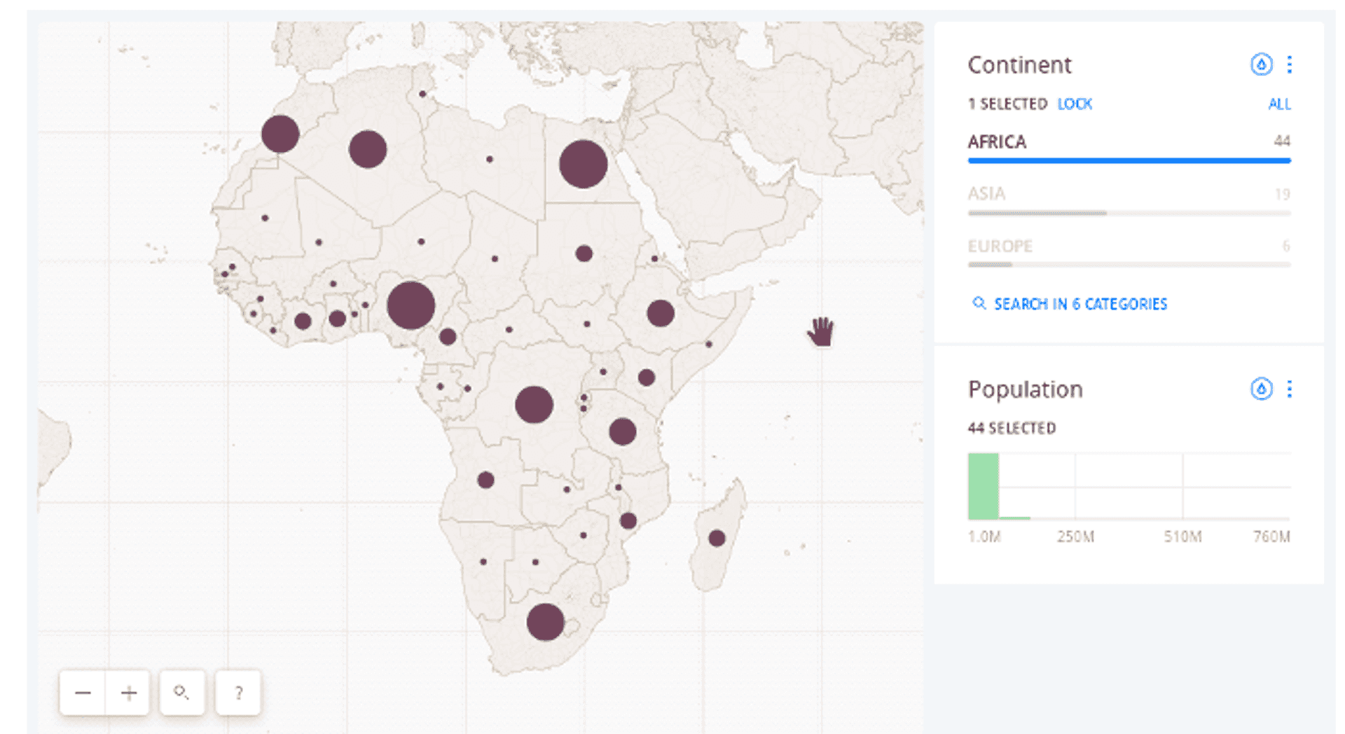
Clustering #
Clustering; perhaps the most classic method of reducing point data overcrowding. The purpose of clustering is to appropriately pull together (‘cluster’) data points that are close together between different zoom levels to avoid map over crowding. Some libraries have nice declustering effects as you zoom in and out. Many web mapping providers provide built in or plugin based marker clustering to account for this. Here's an example using MapBox:
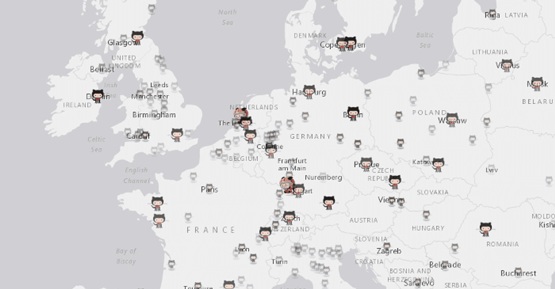
Opacity Based Rendering #
When I was building the GitHub map, I faced a noticable problem when zoomed out. The density of the cities at these zoom levels made the whole map very cluttered and hard to digest the location of cities with high (normalised!) number of Github users. Due to the power of functions and the expressiveness they provide it was possible to create an effect which would essentially allow all city points to be seen at full opacity when zoomed in, and reduce the opacity of less significant points at lower zoom levels.
Binning #
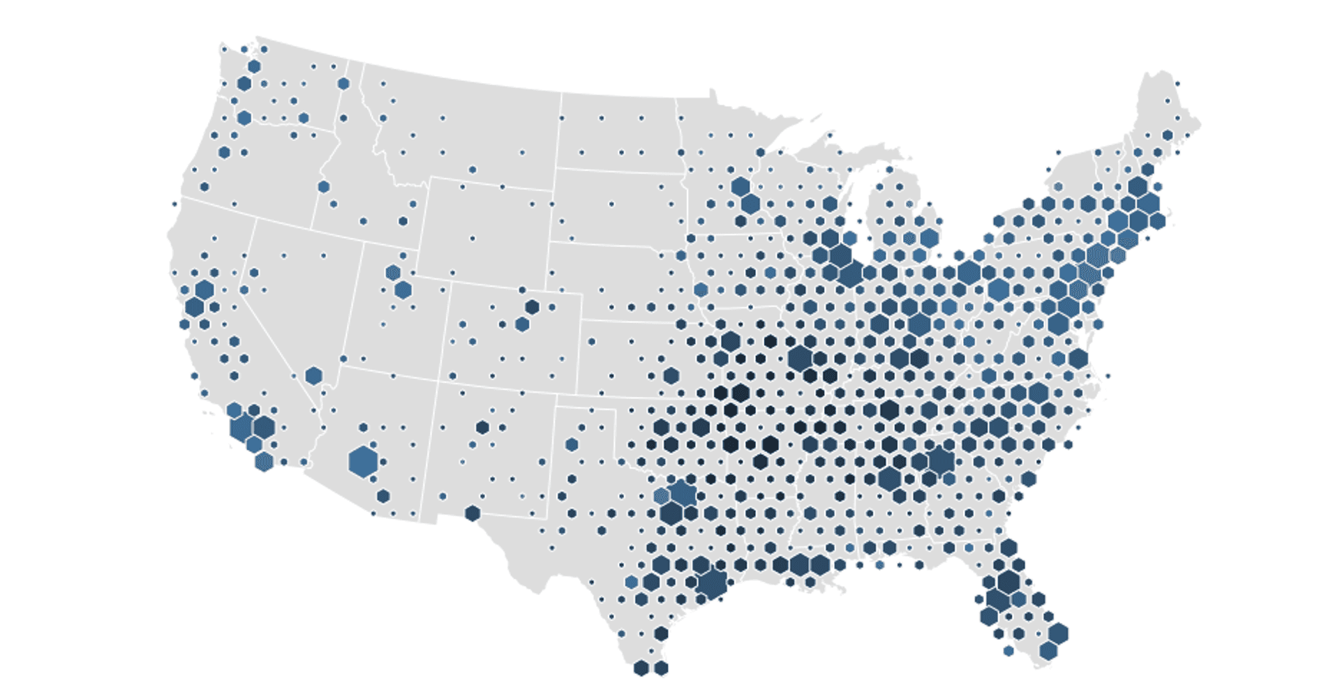
The perhaps unfortunately named binning approach allows you to pull together points in a geographic region and ‘bin’ them together, taking some average value of an attribute data (or even just density) to give a value to the bin shape. The most classic bin is most likely the square, but variations on this include hexagons and triangles. Here’s an example from Mike Bostock (the author of D3.js) using bivarate coloured hexagon bins for data on median age of shoppers of a popular supermarket chain:
Heatmaps #
The classic heatmap. Heatmaps allow you to create a continuous surface of some geometry attribute (or again just point density). Heatmaps can often be misused and certainly have their downfalls (this blog post by Kenneth Field gives a good explanation as to how and why) but for certain data and expressed correctly I believe they can be a useful approach. I think this is especially true when the blur effect distance is a function of some real world distance relating to the data points themselves. Here is an example of a heatmap depicting Earthquakes using Esri's ArcGIS JavaScript API:
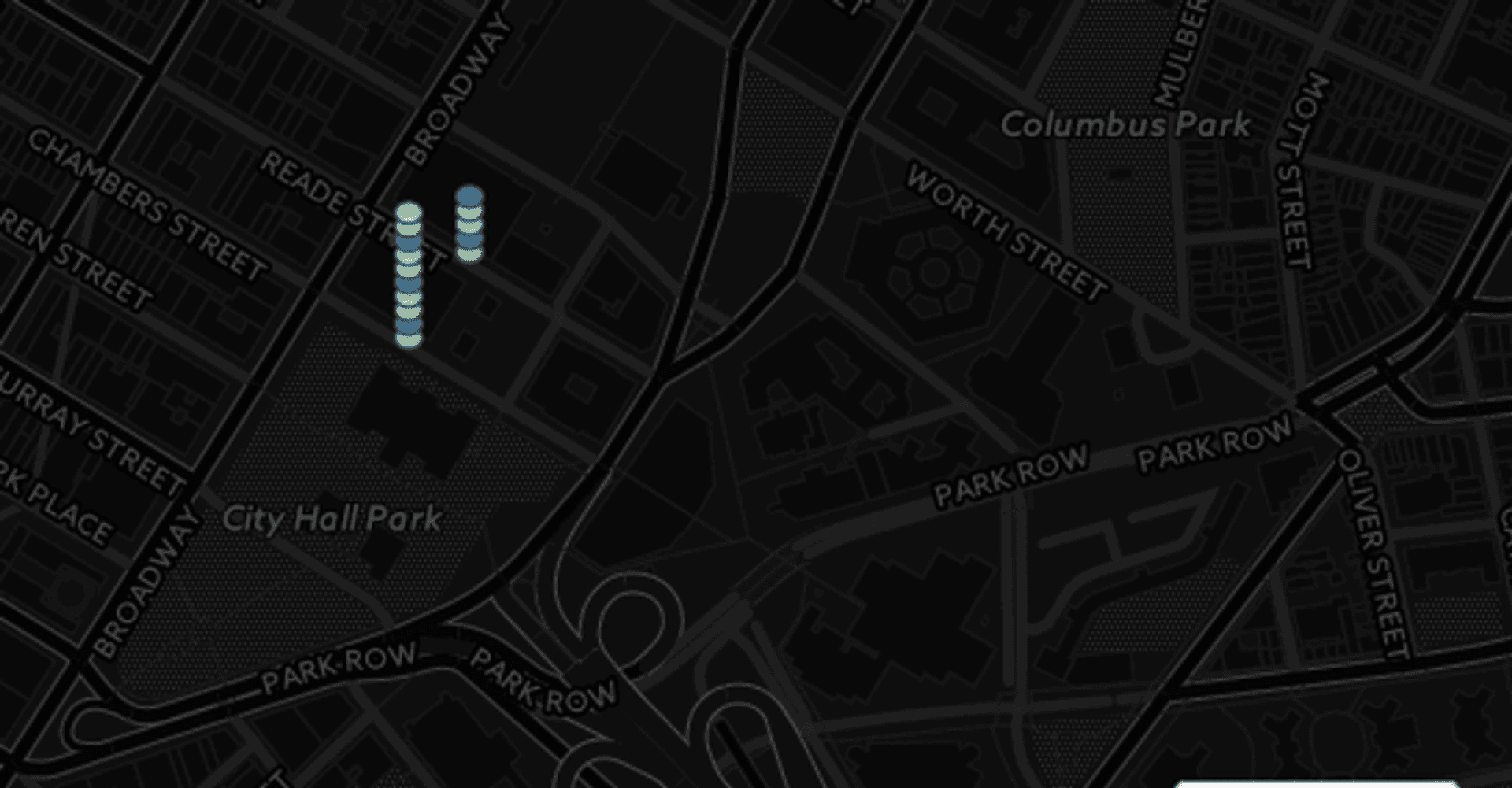
Collision Detection #
For your users finding a useful data point amongst hundreds can sometimes be like trying to find Wally (Waldo) in a crowd, only an order of magnitude less entertaining. One technique we have been looking into at my current work is using collision detection. Collison detection allows you to determine when markers or labels collide with each other and hide the ones you are less interested in (this can be implemented via some sort of weighting system). For or specific example we wanted to prevent label overcrowding. Thanks to Vladimir Agafonkin's rbush we were able to determine collisions and weight appropriately for our use case. This allows us to only show the most pertient labels at each zoom level. It turns out that MazeMap already worked on a similar idea as an opensource project for Leaflet, so shout out to them too! Although in our case we tackled map labels the same idea could be used with markers or other map items too.
The Geovation Hub along with our friends at Podaris (a super cool startup building a real-time infrastructure planning platform) helped us release Labelgun to combat the label overcrowding problem. Labelgun works across mapping libraries as it depends on label coordinates rather than their implemented objects. Here's a demonstration of how that works in Leaflet:
Chips #
Chips (think poker, as opposed to what Americans call crisps), are arguably one of the more more recent approaches on the list. They offer a unique way to visualise multiple data points that share same location. Chips stack markers as small chips vertically, allowing them to be more clearly exposed to end users. The Carto team gave some great coverage to chips as a visualisation technique in the aforementioned blog post. From my perspective they lose there advantage on highly dense visualisations as they begin to overlap and expand very far north. If you want to try the approach out Ivan Sanchez has implemented this in Leaflet alongside the explanation given in the Carto blog post.
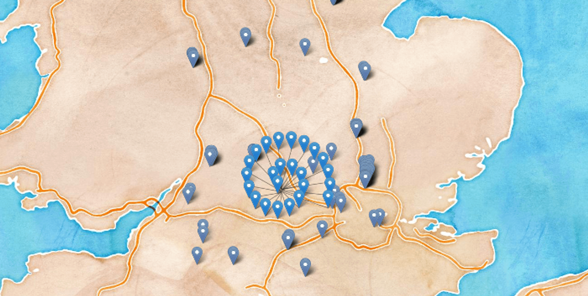
Spidering #
Spidering (arguably another unbefitting nomenclature) is another way of compressing overlapping information points. The approach fans out markers away from their central overlapping point. This works well for locations that lots of markers sharing the same point, but are sparsely placed. This might be appropriate for say highly populated global cities but fall down for more continuous data sets. There are examples of this in Leaflet and also in Google Maps. Here is in Leaflet:
Pie Chart Markers #
Pie and chips, both classic English cuisine, but also arguably two sensible ways to express multiple points with different attributes at the same location. Chips and pie charts have a similar set of properties, but pie chart markers have the advantage of showing ratios of attributes to one another slighty better. A good example use case for pie chart markers might be showing the percent of voters for various political parties in a city/ward.
Pie charts also produce a drastically different visual effect, which might be more fitting to your purposes. Furthermore they can be combined with clustering to inherit the its benefits of better visual aggregation and simplification at lower zoom levels. I would posit that their sweet spot is at around 2-5 different catagories displayed but they probably begin to lose focus at a higher number. For a full break down of the approach check out this superb blog post from the breakdown take a look at Ordnance Survey's cartographic design time regarding their implementation of this method.

Layer Switching #
One thing I always ask folks who want to visualise lots of data at once is why? Most of the time it isn't actually necessary to visualise that much data at one time, and is an active blow to the end user experience. Assuming that you are visualising data of different types/categories (for example, say bars, cafes, restaurants etc) you could add a layer switcher which would allow users to pick the specific type they're interested in. This should reduce the amount of data you actually show at any given time, allow users to find what they want faster, whilst also boosting performance. Here's an example from Carto:
Bonus: Stateful Markers #
Although not explicitly about reducing density, one feature I've seen recently that I think adds a nice effect is to add some change of state to a marker once it has been viewed. This is similar to how hyperlinks might turn purple after you've viewed them on a webpage. I first noticed this approach when using Airbnb for the first time. Here, the way in which the markers changed provided utility as it allowed me to see which of the available properties I'd already explored.
Bonus: Data Capping #
For performance reasons you may want to set a hard limit on the number of markers that actually get rendered to the screen (I'd put 500-1000 as a decent limit for most maps, potentially less). In a similar manner to collision detection, you may want to refresh this at higher zoom levels so that you can actually see detail as you zoom into the map. Ideally you might want to do this in a way that allows for good dispersion of markers over a geographic area for a better visual effect and reduce.
Conclusion #
Hopefully that's been a useful breakdown of potential approaches to reducing data clutter on your maps and subsequently improving user experience. I really welcome any feedback and comments, or even potential additions! Lastly on a more general note I would advise examining the Ordnance Survey's cartographic design principles for more in depth look at how to effectively show data on map.
Published